
'%20x='0'%20y='0'%20height='100%25'%20width='100%25'%20%0A%20%20%20%20%20%20%20%20%20%20xlink%3Ahref='data:image/jpg;base64,/9j/2wBDAAYEBQYFBAYGBQYHBwYIChAKCgkJChQODwwQFxQYGBcUFhYaHSUfGhsjHBYWICwgIyYnKSopGR8tMC0oMCUoKSj/2wBDAQcHBwoIChMKChMoGhYaKCgoKCgoKCgoKCgoKCgoKCgoKCgoKCgoKCgoKCgoKCgoKCgoKCgoKCgoKCgoKCgoKCj/wgARCAAFAAoDASIAAhEBAxEB/8QAFQABAQAAAAAAAAAAAAAAAAAABAb/2gAIAQEAAAAAJJf/xAAUAQEAAAAAAAAAAAAAAAAAAAAE/9oACAECEAAAAC//xAAUAQEAAAAAAAAAAAAAAAAAAAAG/9oACAEDEAAAAGP/xAAgEAABAgUFAAAAAAAAAAAAAAACAQMABAURIQYHEhMU/9oACAEBAAE/ANUVO1A3dlXZdomw8ICI4GzbogMKSAqh0Sy8cXVuP//EABgRAAIDAAAAAAAAAAAAAAAAAAABBBES/9oACAECAQE/AJqrJ//EABoRAAEFAQAAAAAAAAAAAAAAAAIAAwYhcbL/2gAIAQMBAT8AjVk7gcr/2Q=='%3E%3C/image%3E%3C/svg%3E)
We're racing into the 2017/18 season and the excitement is palpable. The clubs have flown back home after their pre-season friendly matches where they have showcased teasers of their new strategies and more importantly their new acquisitions.
But not a lot of things are better agents of the fresh and new like the club kits. The stalwarts of the sportswear industry drop ink to fabric to make sure they are captivating to the eye and the revenue from their sales is plentiful.
The subtlest of mistakes can cause great financial setbacks if the fans don't deem a kit worthy of being bought. Its an intricate process that combines technology and the creative think tanks who decided to put the lines and the stripes where they are. And what we can do is sit back and judge for now.
So let's check out the 5 best kits in Europe this year.
#5 Barcelona
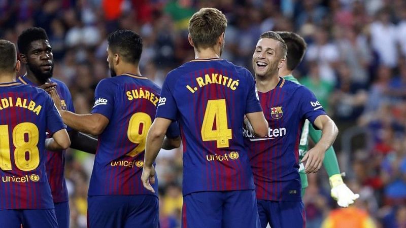
Of course, there's no room for the dreary on Barcelona's armour. And you ought to expect Nike to be privy to that. The club's primary colours are all in tact- the deep blue base, the maroon stripes (that fade into lines) and the yellow on the sponsor logo and the club crest. The yellow and maroon strip that runs around the collar is a nice touch. It might just be me but maybe the stripes could have extended to the sides too.
But all in all, La Blaugrana will look like the elite club that they are. And that's compliment enough.
#5 Paris Saint-Germain

Well, you don't need to school the Parisians about fashion.
And with PSG making their biggest statement yet by signing Neymar for a whopping €222m, the last thing you'd want them to do is to dress him up in an abomination.
Nike gets it spot on with the kit though. They've cut the thick sides of the strip that runs down the middle. The thin line gives the kit a classy finish.
The kit as a whole looks like something that was carefully planned out. The symmetrically placed sponsor logo and the club crest complement each other. And so does the sponsor name that runs down the centre. The faded maroon on the sleeves is a welcome addition.
#3 Liverpool
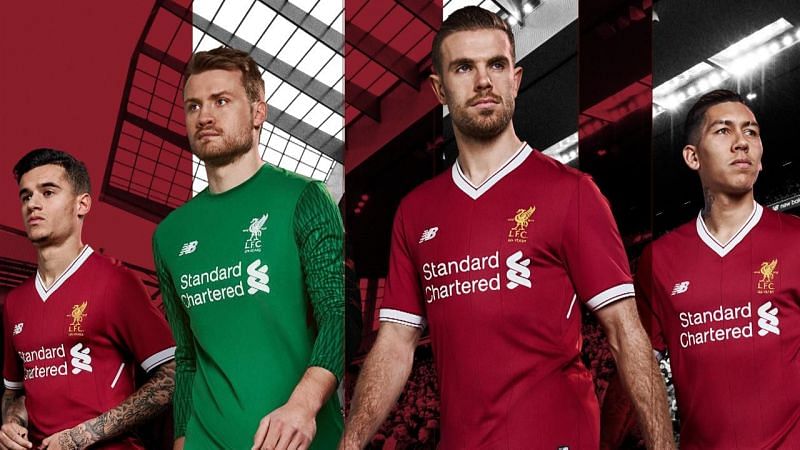
New Balance has balanced it out well and have managed to keep Liverpool's kit delightfully classy with retro shades.
Liverpool will sport a slightly darker red when they go out to battle at Anfield. More than anything, it is how well the sponsor name and their logo adds to the aesthetic charm of the kit which wins the Reds a place on the podium. This is hard to come by and therefore deserves adulation.
Also read: Fantasy Premier League Tips: 5 forwards you should pick this year
The red is an invitation and the whites are like the free drinks that are going to make you stay. The club crest stands out in gold. There is a thin red line that runs down the bottom of the white strip and one on top of the white strip around the collar. New Balance has done with the minimal dabblings in fine fashion.
The Liverpool kit is one of the best in the Premier League and rightly deserves its place in the top 3.
#2 AS Roma
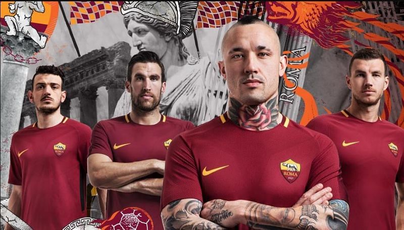
The Burgundy shines right through and the absence of the sponsor name just elevates this kit into the realms of the classic ones. There's a subtle chest design which makes Radja Nainggolan look like a battle-hardened savage you don't wanna mess with.
The yellow dashes on the colour, kit logo, and the club crest strike an alluring partnership which makes it difficult to take your eyes off of this beautiful creation by Nike.
Nike has gone minimalistic with all their kits this time around and have kept the details down to a minimum on the Premier League kits as well. Take for example Chelsea, Manchester City and Tottenham and you can see how Nike have stuck by the less is more motto.
#1 Bayern Munich
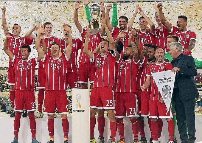
There are kits you buy to run around the ground on a Sunday with yer mateys, there are kits you buy to wear when ya go watch a match at the pub downtown and then there are those ones that you spread out and hang on your bedroom wall so that you can wake up every morning to a touch of beauty.
Adidas has done it again.
They have brought back their classic three stripes in Europe and Manchester United have also benefitted from their classy upgrade this year.
And Bayern's kit is a beauty.
The good ol' pin stripes look majestic on the Bayern red. It looks radiant and retro while being classy at the same time.The slightly darker shade on the shoulders, the white band around the neck and the sleeves... Adidas knows how to dress the big guns up in style. Classy and sophisticated, Bayern will arguably look the best under the floodlights that will light up the Champions League nights this season.
Also read: Bundesliga 2017/18: How Bayern Munich could line up this season
